Gluten Free Finder
App guides people to discover Gluten-Free restaurants worldwide.
Project Overview
Background
The research was initially done for this project, and I was given essential insights from the user interviews. With that information in hand, I came up with solutions and created UI designs that were user-focused.
My Role & Project Duration
UX/UI Designer
1-Week UX/UI Challenge
The Goal
The goal was to create a user-friendly application to help people find gluten-free restaurants anywhere.
Understanding the User
Research
To better understand and empathize with consumers, I began researching gluten intolerance and celiac disease. Then, I came up with some desirable features according to my findings and the given insights:
User Insights
“Finding gluten-free places during my travels is very painful. If I’m lucky I can find a dedicated gluten-free restaurant, otherwise it’s very hard for me to trust a place. The risk of cross-contamination in a regular kitchen is just too high.”
“It’s not just about being gluten-free, but the culinary experience. Just because I’m sensitive to gluten it doesn’t mean I don’t want to have a romantic dinner during my holidays with my partner.”
“Gluten-free bakeries and restaurants can be overly expensive, it would be great to discover those within a reasonable price range close to me.”
“I usually revisit the gluten-free places where I had a good impression, but I tried so many, that it is hard to keep track of them.”
Solutions
The users should be able to easily find a new restaurant with their specifications.
The users find it useful to read about restaurant reviews.
They’d love to save favorite restaurants in a list and share the list with others.
Customers would like to know how pricey the place is, so in the descriptions should be price indicators.
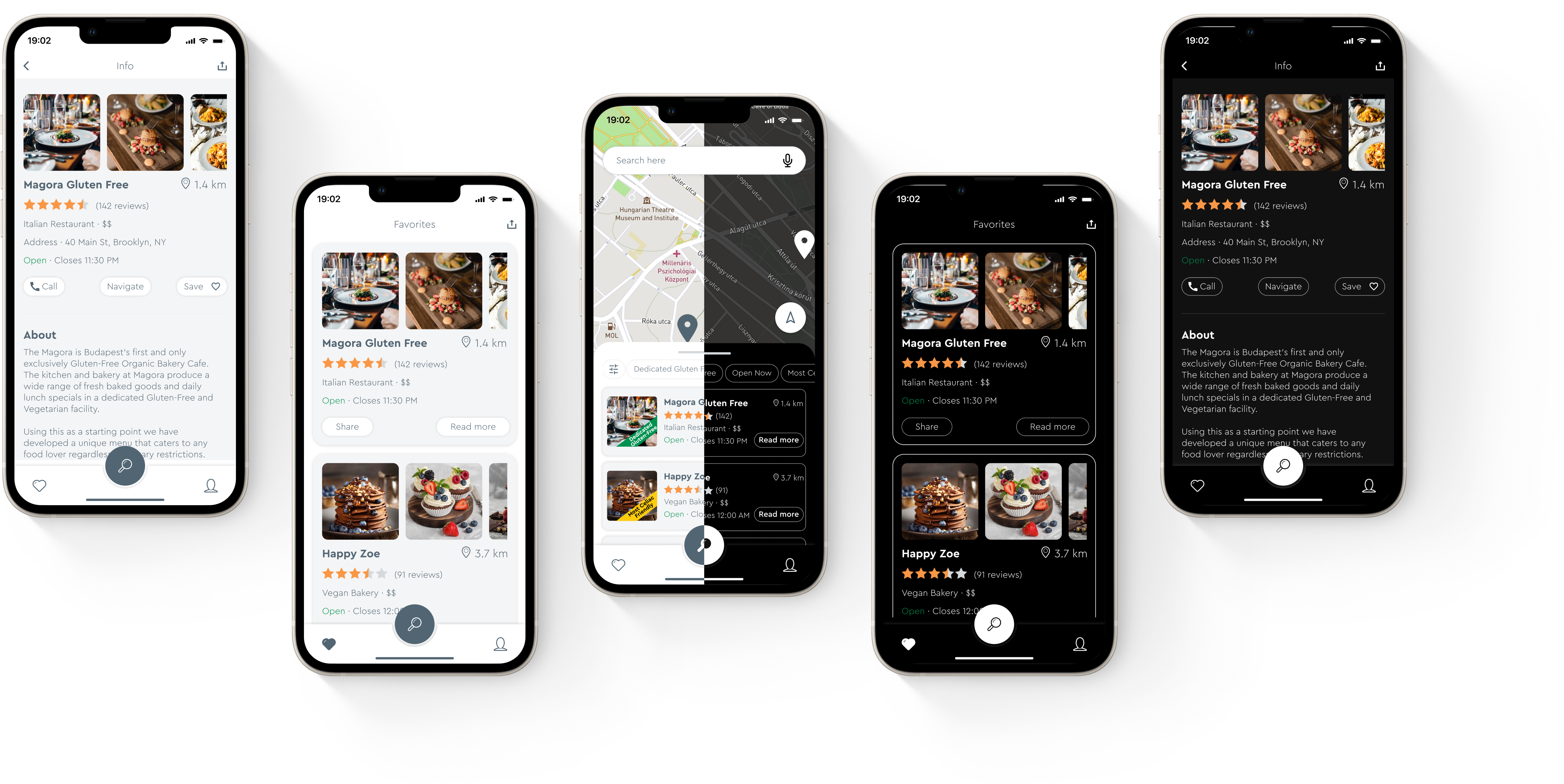
A big part of the users would be travelers, they might be tired and hungry, and most likely they are using the app with a low phone battery after taking lots of photos, so I thought the app should have a dark mode as well to save the battery.
The app should support several languages to be useful for travelers.
Design and Reasoning
Introduction Screens
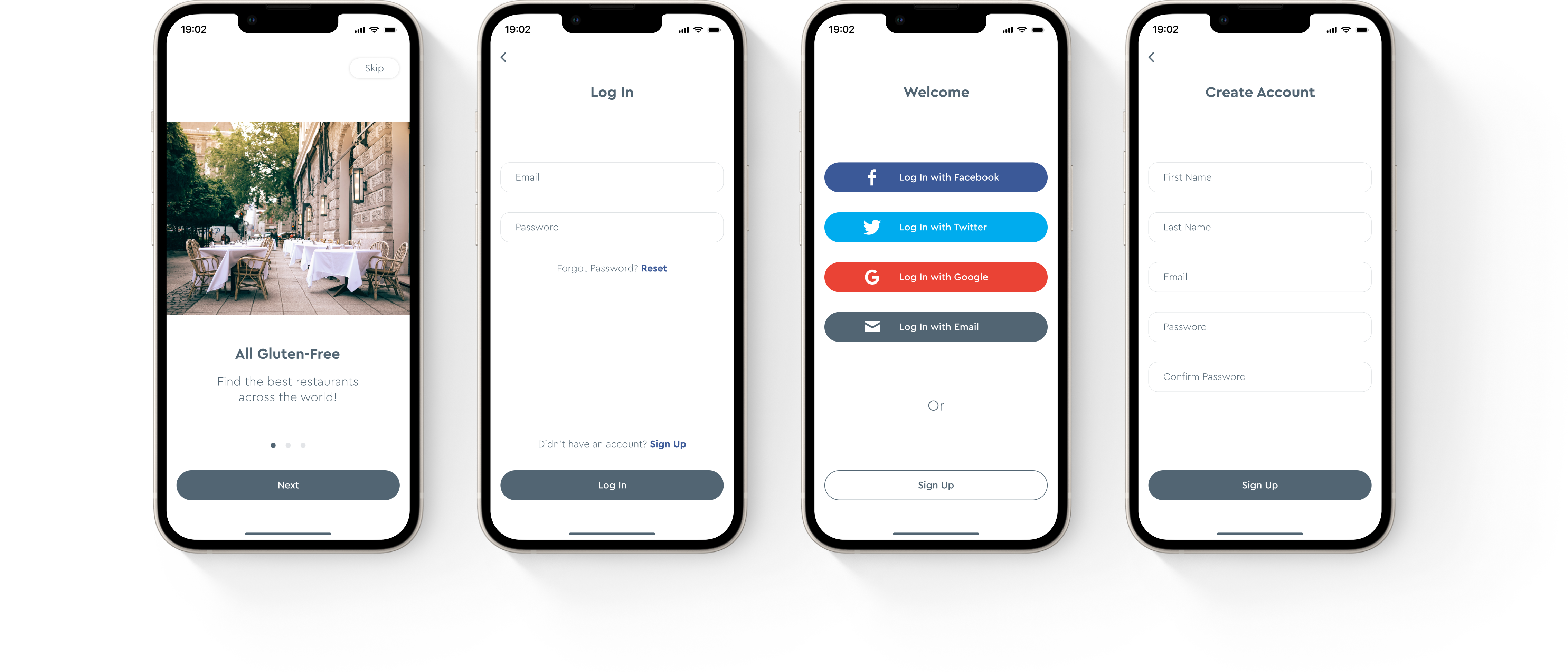
I think for a better experience, every app should have some introduction page to communicate with the users what the app is about before they ask to create an account or log in. So I added 3 introduction screens.
Log In options
Then I decided to add different login options, with all popular social accounts as well as just email sign-ups, to make sure all users can sign in. I also added the forgot password screen in case someone needs to reset their account password.
Home
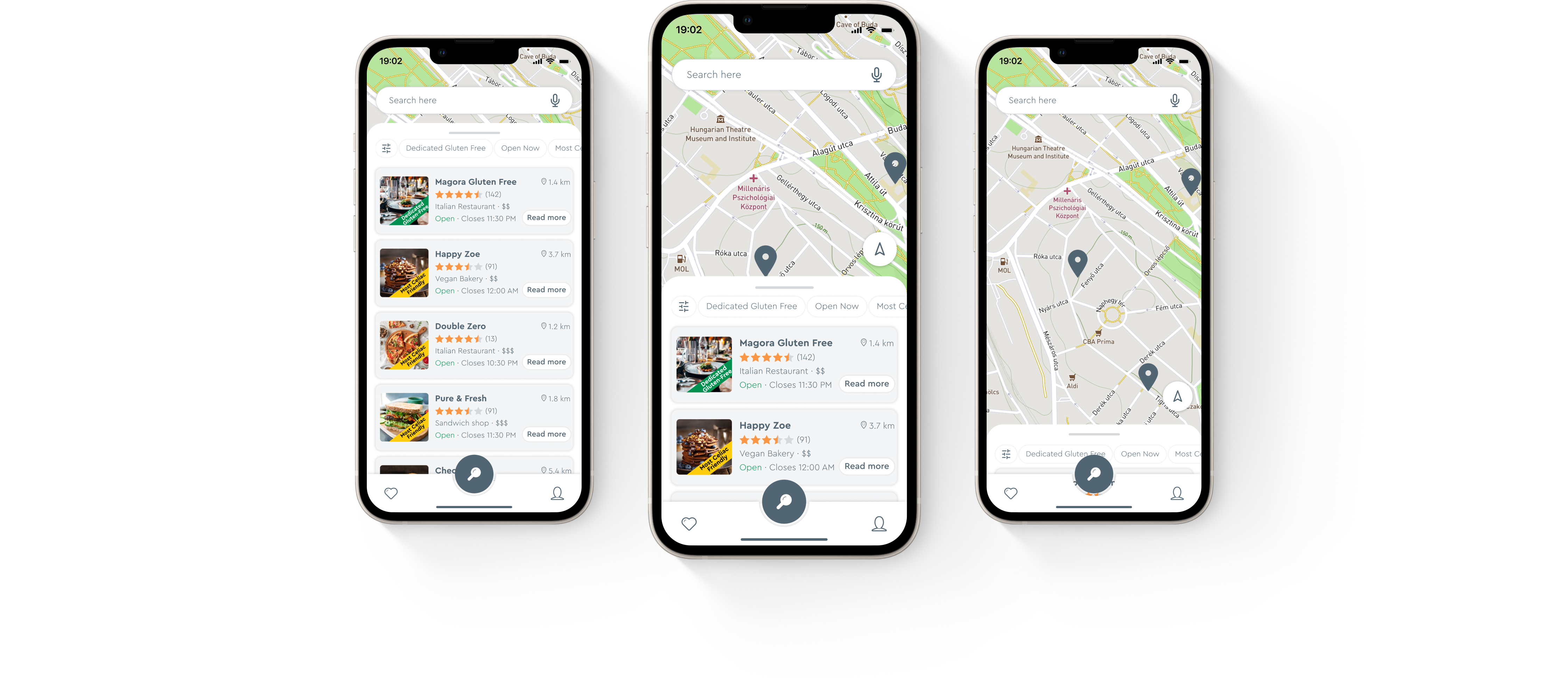
After logging in, the app should be easy to navigate, so I chose a taskbar for navigation. Users can scroll up or down the list view on the map.
Profile
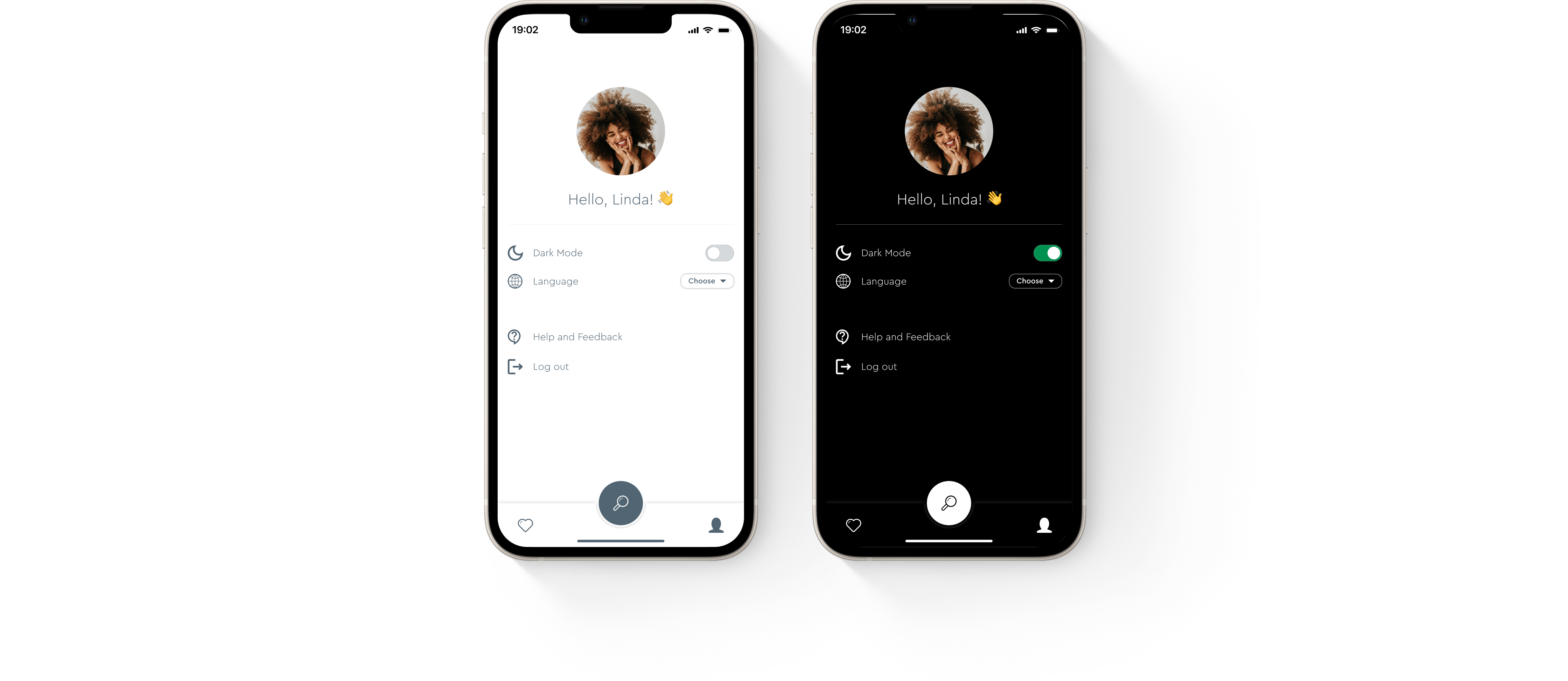
From the Task Bar user are able to navigate to the profile screen where they can choose the language or theme of the app, log out and get help.
Favorites & Share
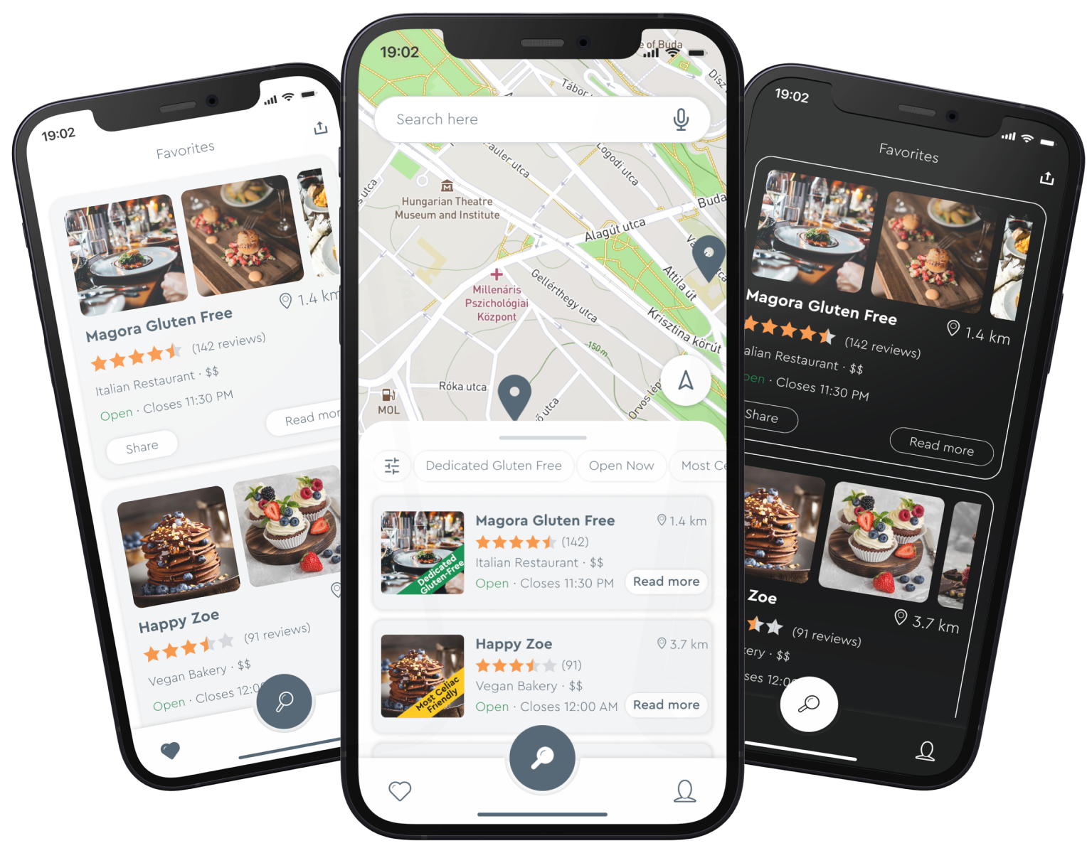
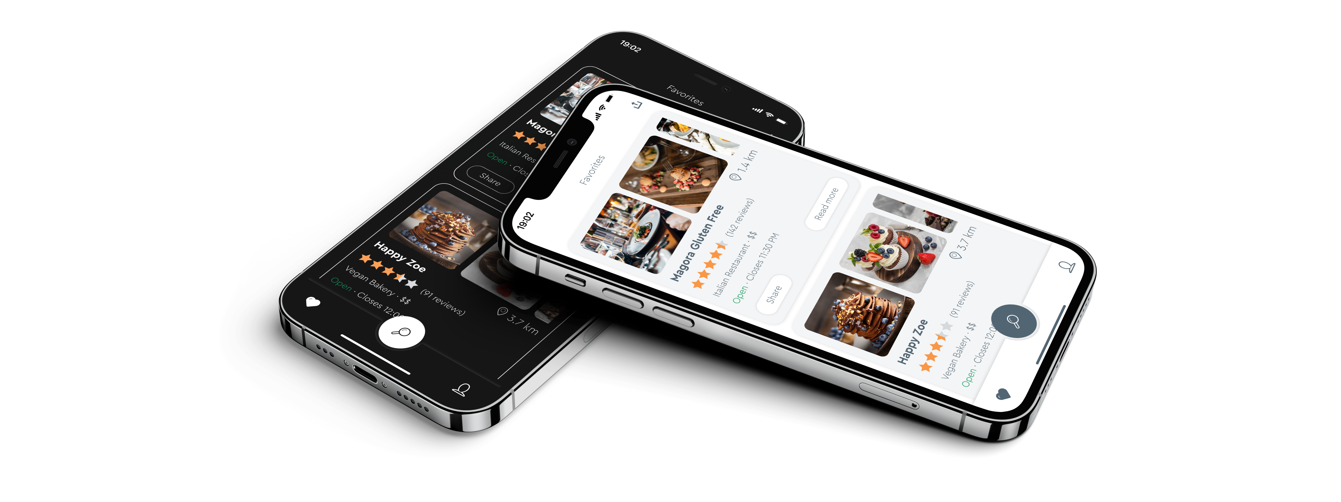
Users can navigate to the favorites list where the saved restaurants are and read more about them, remove them from the list, or share the entire list.
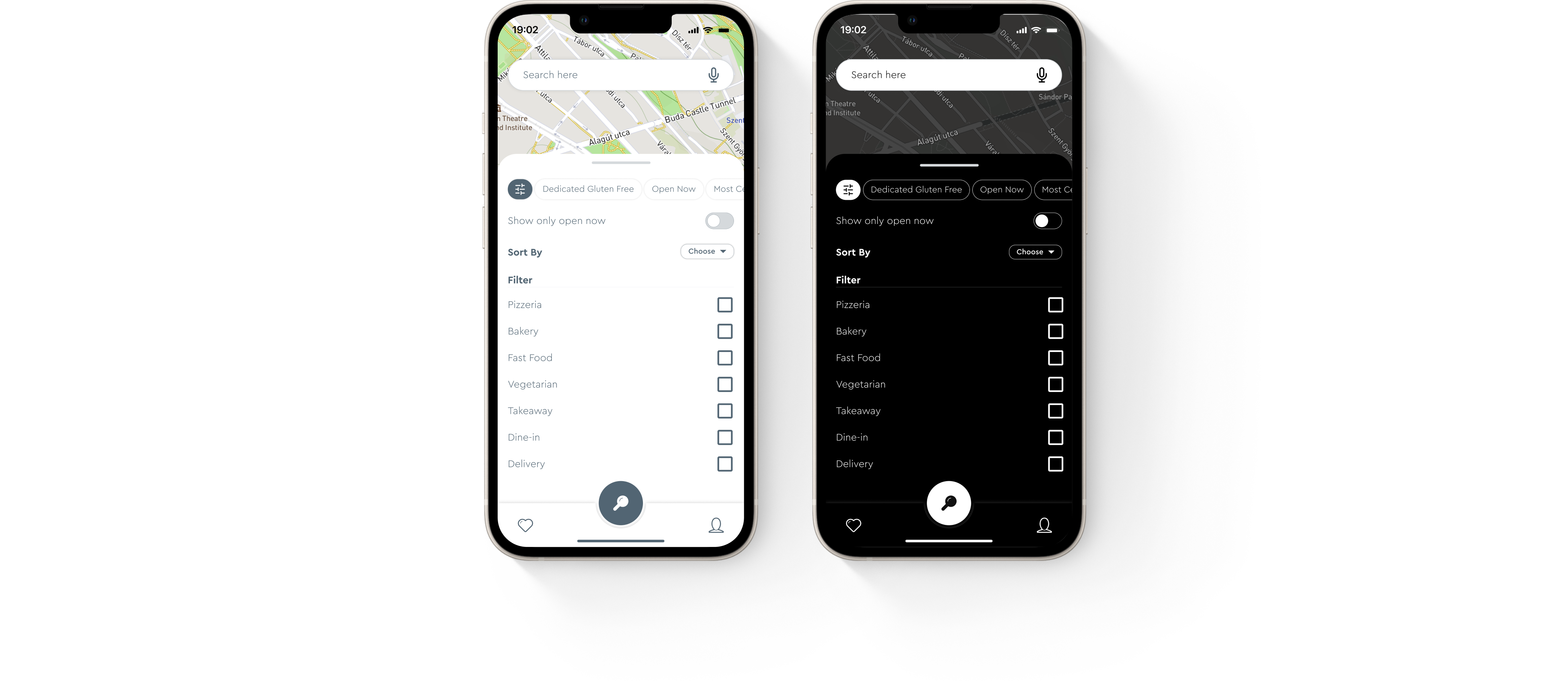
Filter
Using the filter users are able to easily find a restaurant with their specifications. For eg, they can filter by food category, restaurant type, opening hours etc. That feature makes the app much more convenient and easy to use.
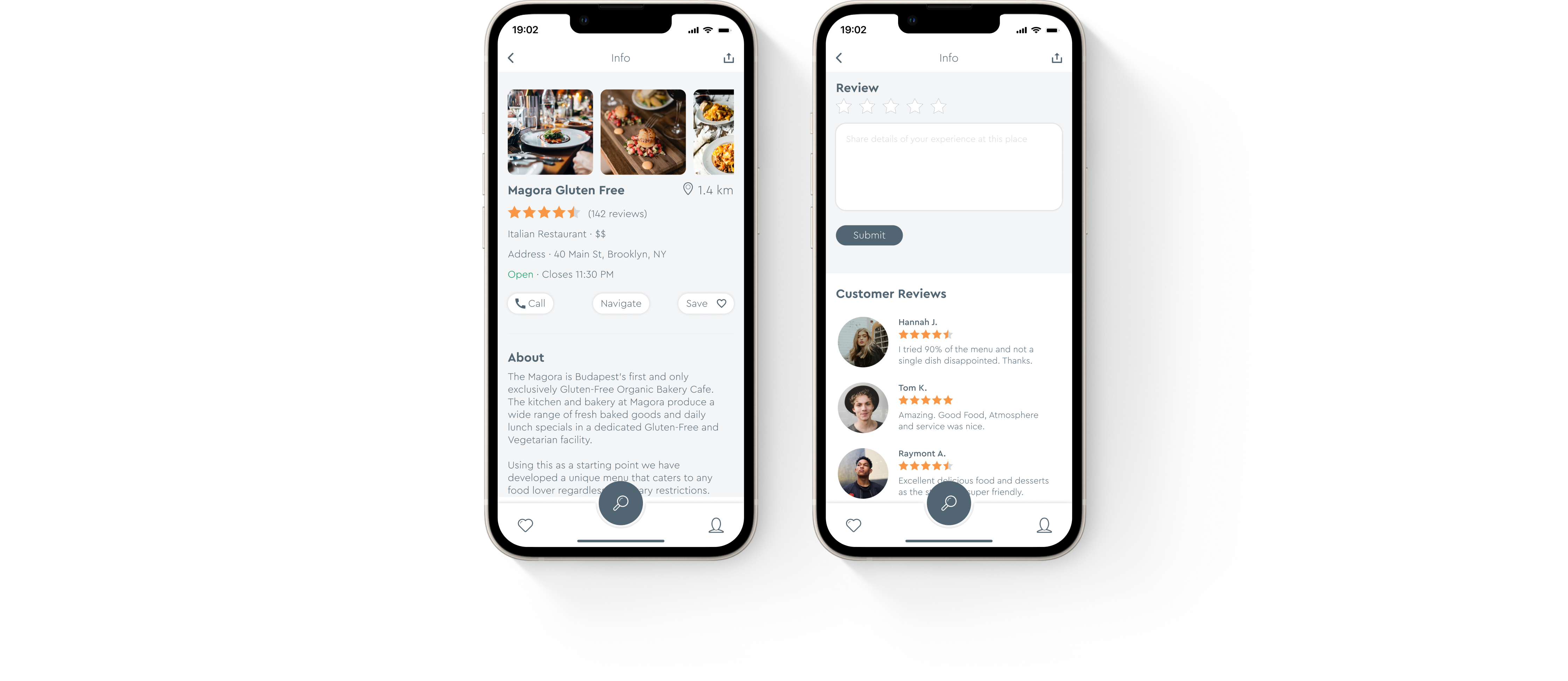
Reviews & Price indicators
Gluten-free bakeries and restaurants are often overly expensive. So, before visiting the place would be great to have an overall idea of how pricey it is. Price indicators and customer reviews would be helpful for this. Hence, there is a restaurant info page where users can read their descriptions and reviews, make a call to reserve, get restaurants' locations to navigate, write reviews after visiting and add them to their favorite list.
Light and Dark Themes
Design System
Colors
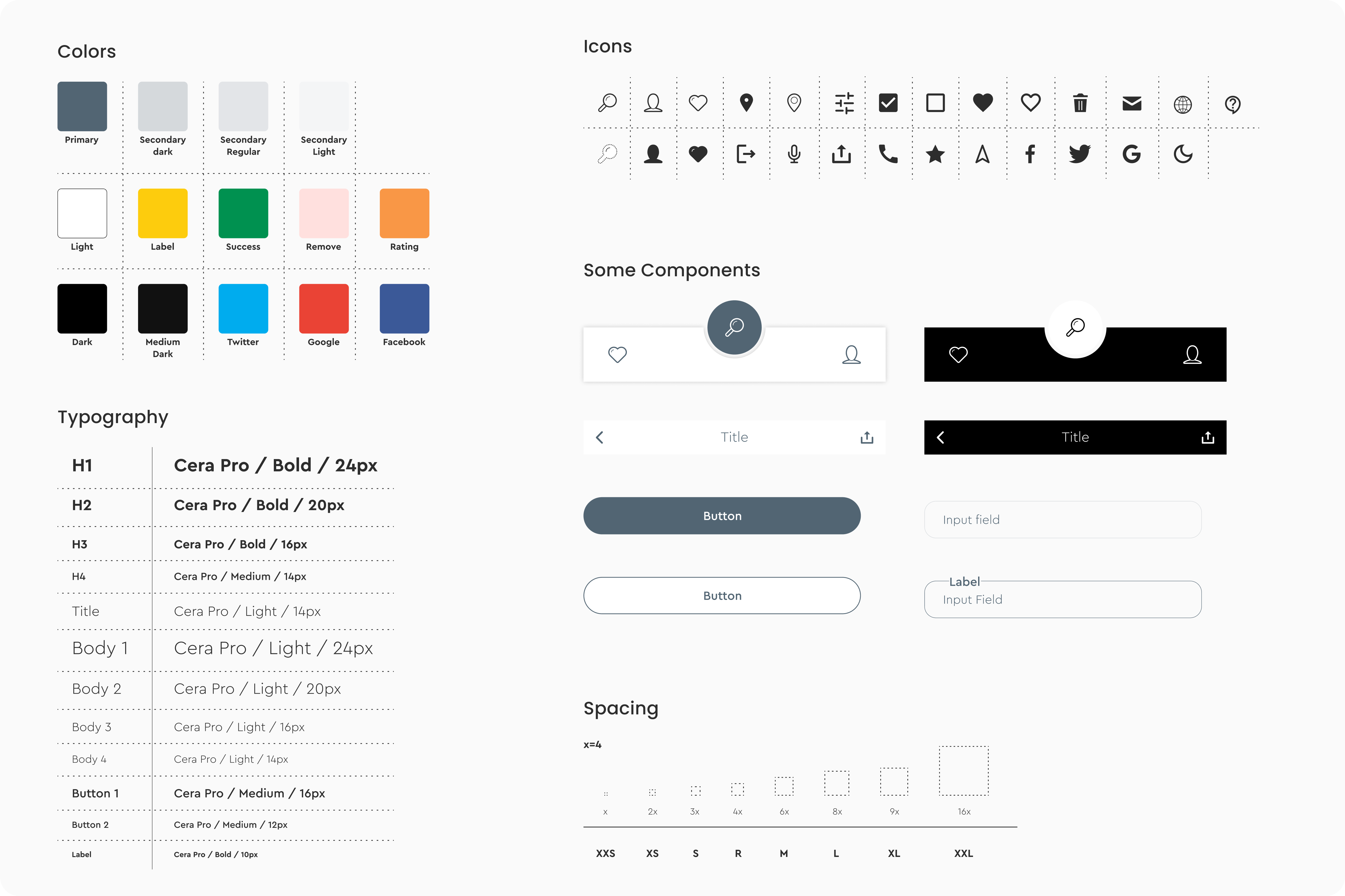
I chose a white background and metallic silver as a primary color. There is a lot of reading in the app, so I needed color which would not be annoying for users' eyes, which would be solid and clean. Also, the white and silver color is kind of kitchen colors, like a white dining table with white dishes, silver spoons, and forks, a white chef's uniform with silver pots and pans. So that is how I got the idea.
Typeface & Iconography
Used typeface - Cera Pro is very clean and easy to read. The letters are based on pure geometry, and it has almost all language support so when the app is multilingual it will be easy to read for everyone around the world. Also, chosen tiny icons because of the minimalist's design approach.
Thank you!
Click on the button if you’d like to check the prototype!
© 2021-23 Elene Zedginidze. All rights reserved.