Reduce Food Waste
App allows people to share Food & Grocery products with NGO communities.
Project Overview
Background
With this app, people are connected to the nonprofit organization - Katarthis which cares about homeless people by offering them daily meals. They can visit Katarthis cafe and have breakfast or dinner there.
My Role & Project Duration
Product Designer
UX Researcher
8 Weeks
The Goal
The goal was to design a solution for people who want to reduce their food waste and help others at the same time.
Research
Research Method
In order to gather related information from other people and understand whether it’s a problem that needs to be solved, I’ve conducted 2 interviews. During the research, it became a lot more obvious that food waste is something my interviewees also think and worry about, I should mention that at that time I wasn’t really sure what would be the final product, but those interviews helped me to get some insights and come up with the ideas.
Some interview questions
What kind of food becomes wasted mostly in your house?
How much food do your throw away in a week?
What motivates or encourages you to reduce food waste?
What challenges do you face while trying to reduce your waste?
Have you ever encouraged others to reduce food waste? And how?
Have you ever given away extra food from your house?
Received Insights
Both of the participants are worried about food waste.
Both of them are interested in teaching their children about that topic.
When everyone in the family eats different food, reducing waste becomes difficult.
Family members often buy products that become leftovers.
There are always some expired products in the fridge.
Throwing away rotten food makes them worried and ashamed.
Usability Tests
Prototype & Scenarios for Tests
After analyzing the insights from the interviews I started creating low-fidelity wireframes and created the first prototype in Axure that was used for usability testing. Scenarios for Usability Tests
What do we see here? Please walk me through your options. What kind of information does the app provide at this point?
Imagine you have some leftovers from the birthday party that you would like to share. Use our application to donate that food.
Let’s say you want to see what you have sent already. Where could you find it?
Imagine that you want to share some milk and yogurts. Use the app to submit your request.
Findings
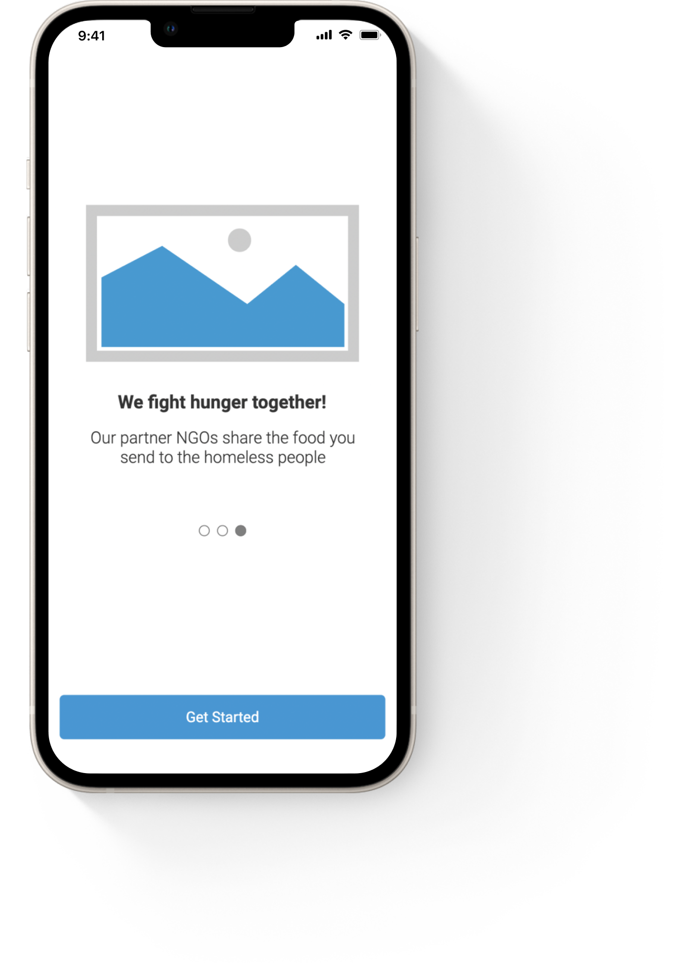
The participant mentioned that he’d skip the onboarding screens in real life. - Need to explain the purpose of the app inside the application, not only on the onboarding screens.
One of the participants was concerned whether products will be good for consumption by the time the courier comes to pick it up. - Explain how the couriers work.
Not sure about the meaning of “Start saving food” and “Overall impact”. - Change the wording, for example to “Our community’s impact”
Adding the expiration date of the product would be interesting. - Add input for the expiration date.
User Journey
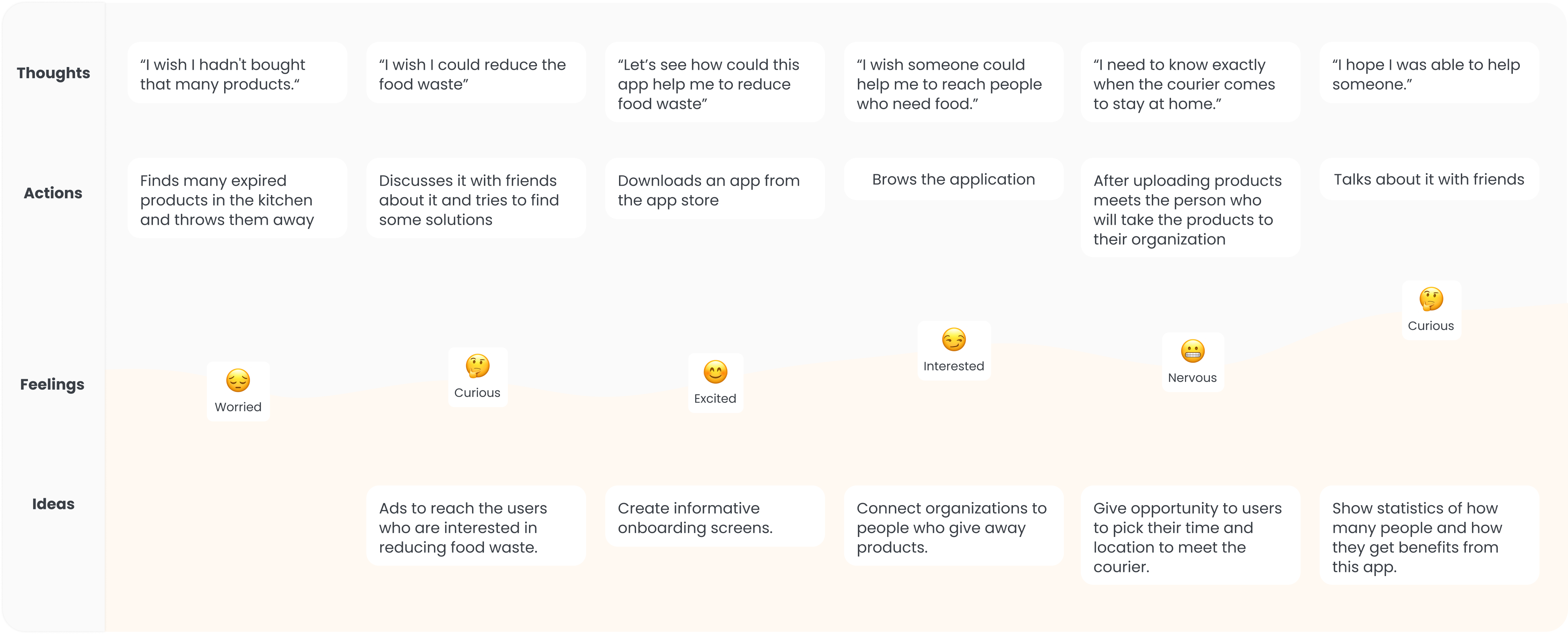
After usability testing, I created the user journey for the scenario where the person is worried about her food waste and the friend suggests downloading this application.
Design & Reasoning
Log In Screens
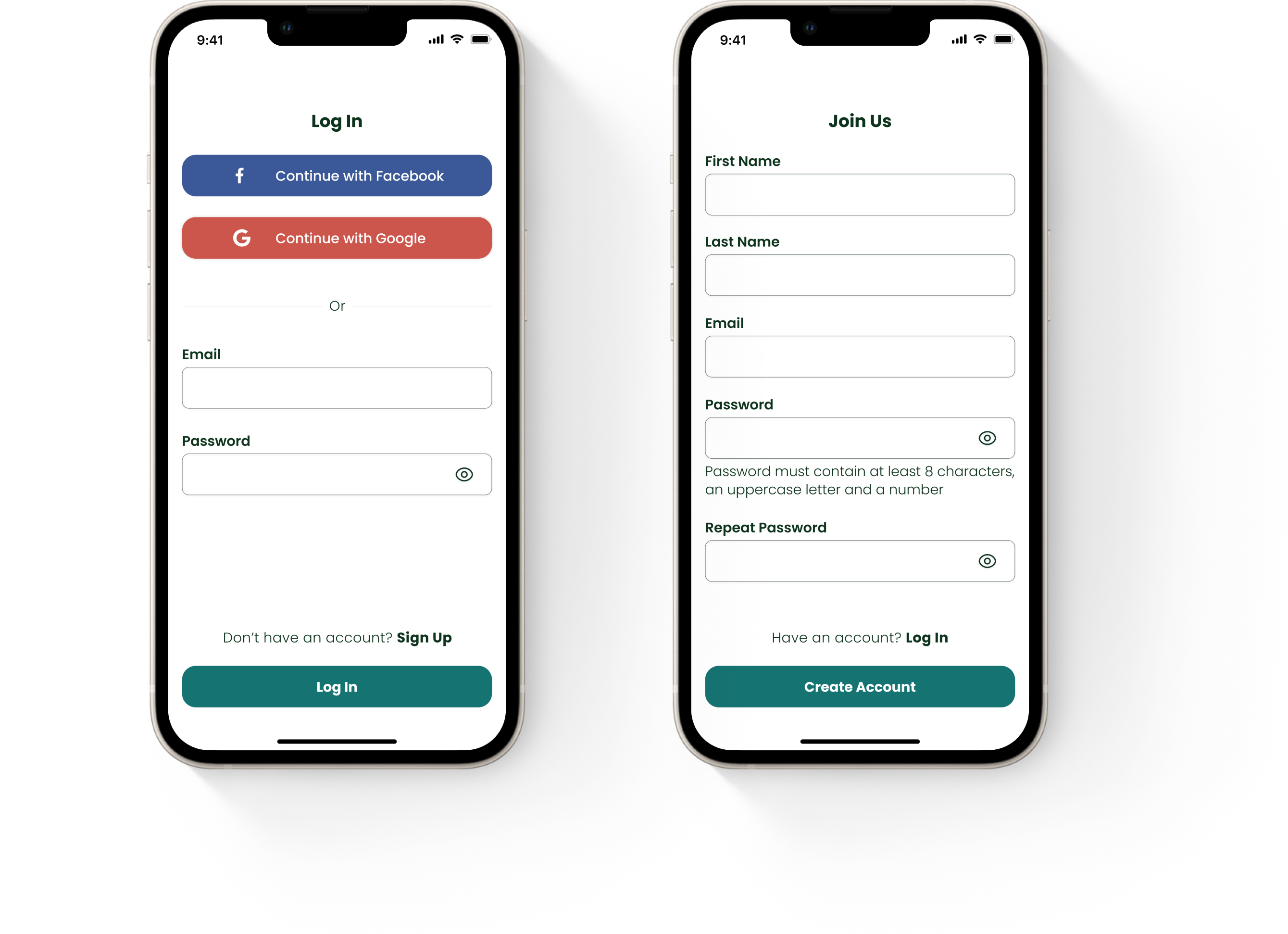
I shortened and simplified the registration process as much as possible and didn't include the number and address fields because:
Asking lots of info at the beginning bothers users.
They might lose interest/motivation to continue.
Asking that info while donating would be more relevant
After the first donation, those details would be saved to their profile and would be easy to use next time
Home
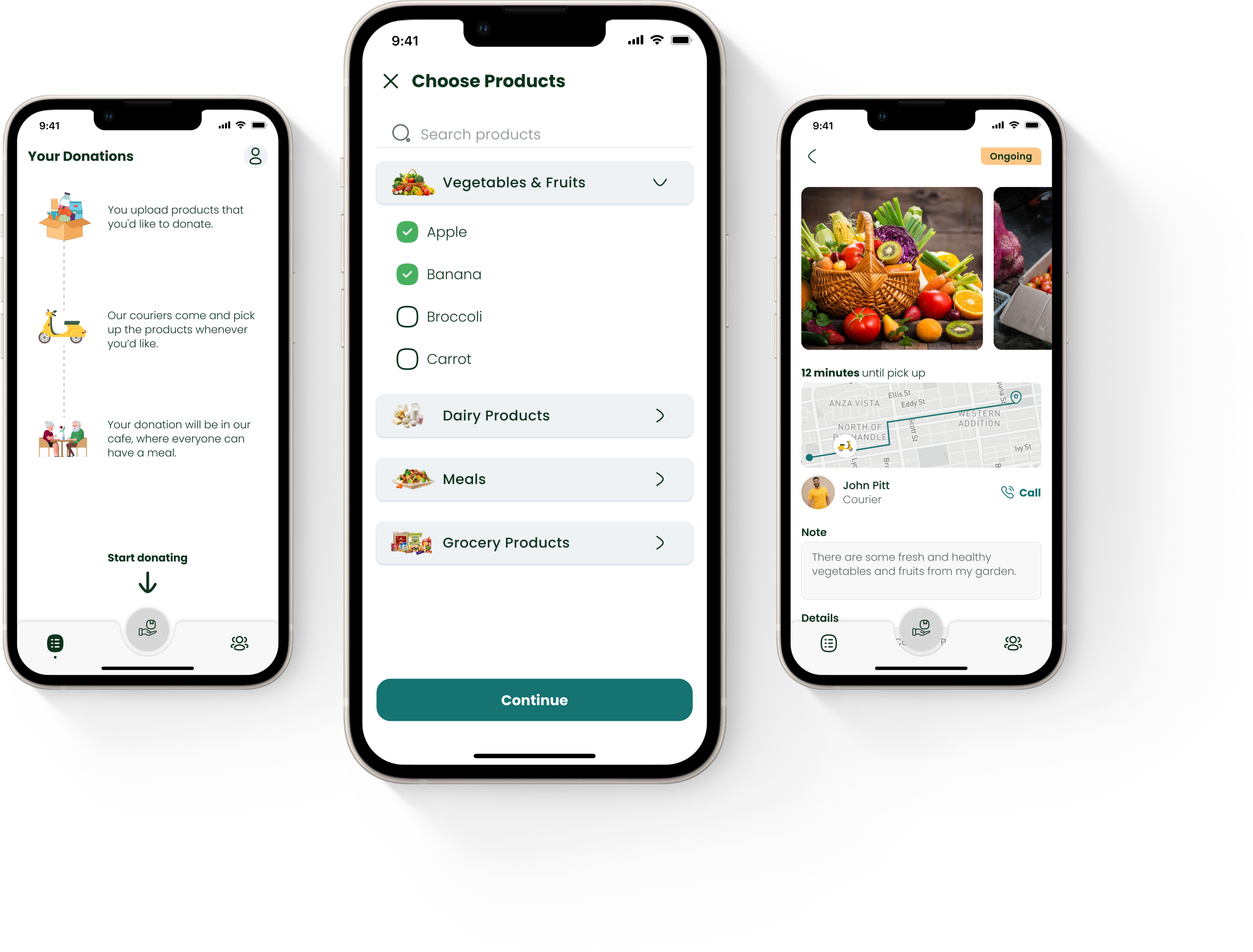
Using the nav bar helped in avoiding the cluttered design and made the navigation easier. From the nav bar:
Users can navigate to ‘Your Donations’, where would be all their previous donations,
using the action button in the middle starts the donation flow,
users are able to click the community and see what others are donating.
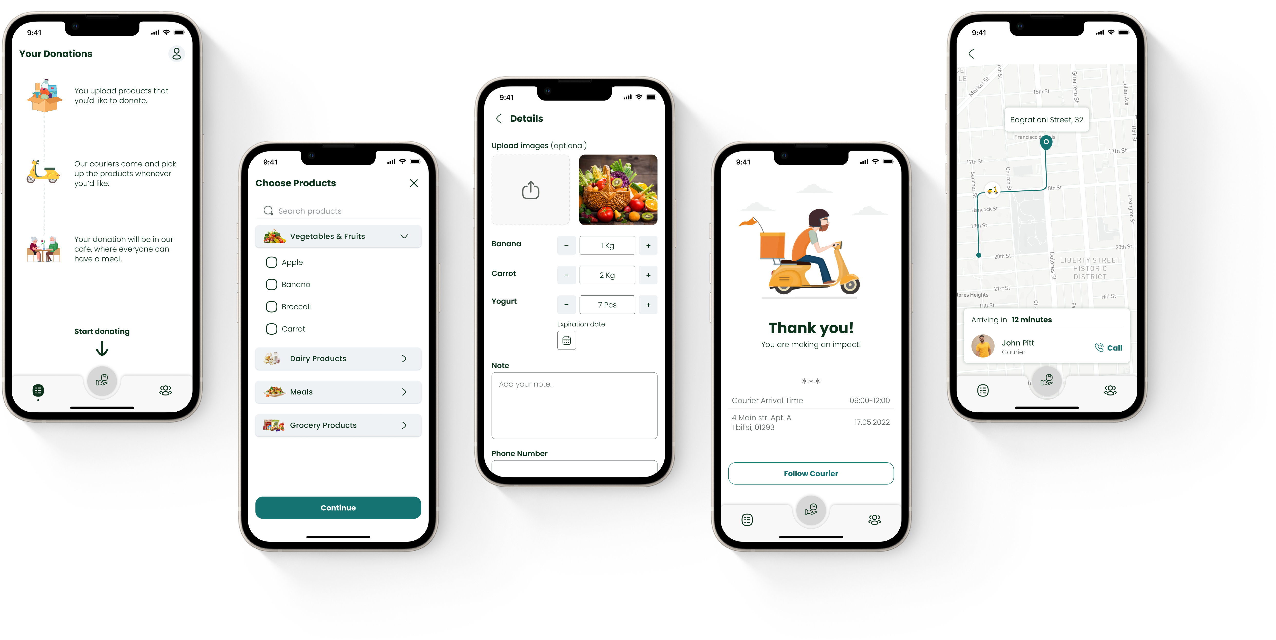
In order to encourage first-time users to take action, I've added a microcopy with an arrow and instructions for them to start donating, that’s an empty state.
Ongoing Donation
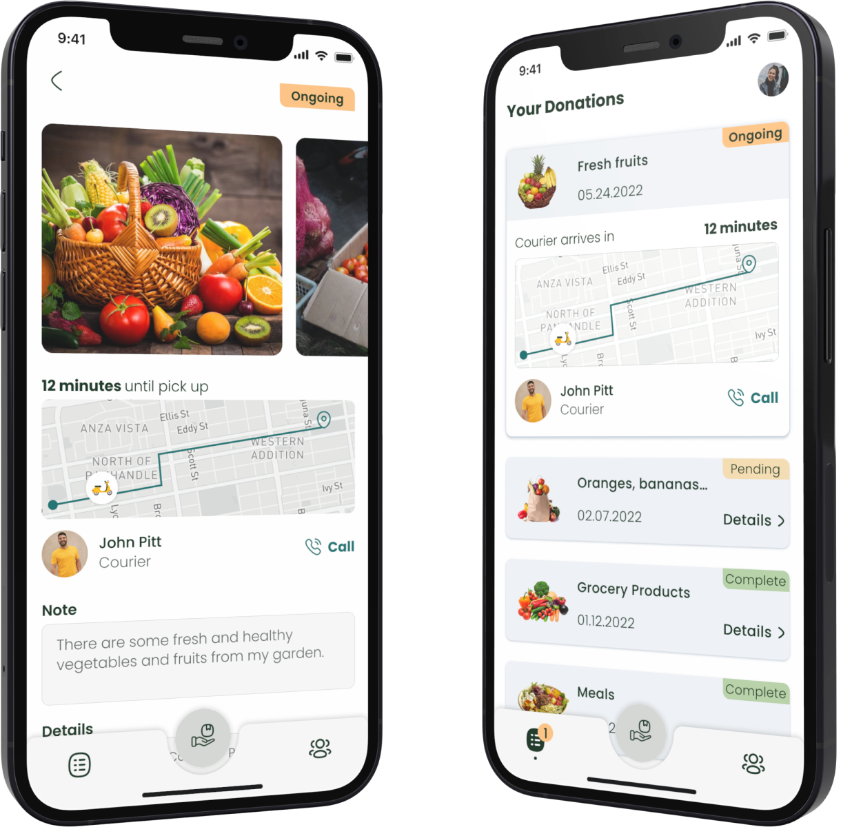
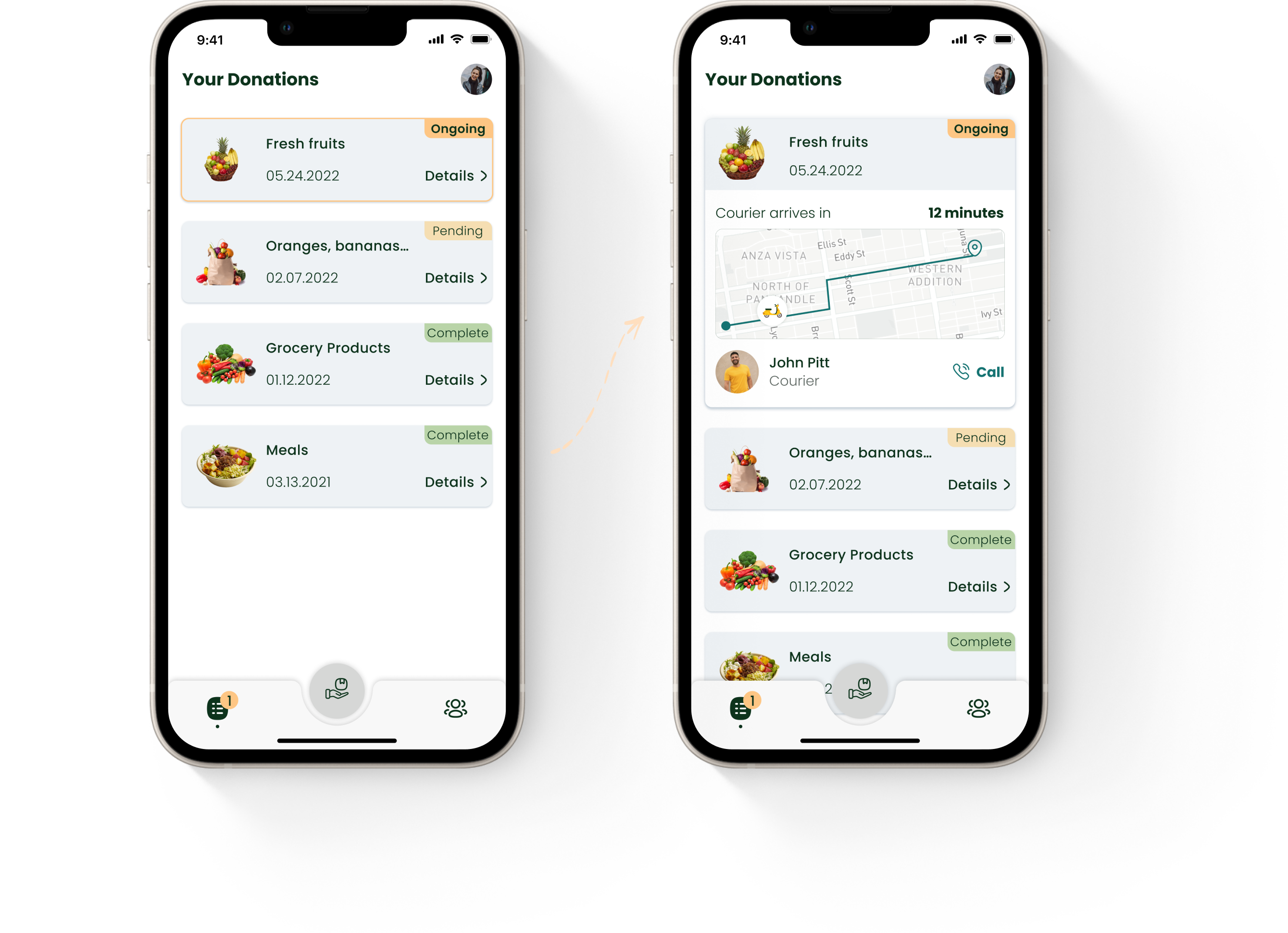
When the user has an ongoing donation along with the donation history, the ongoing donation should stand out to draw the users' attention. To make it more prominent I’ve:
Created an extended version of the card where the most important info, such as courier details and arrival time is shown
Added notification indication on the nav bar
The Goal
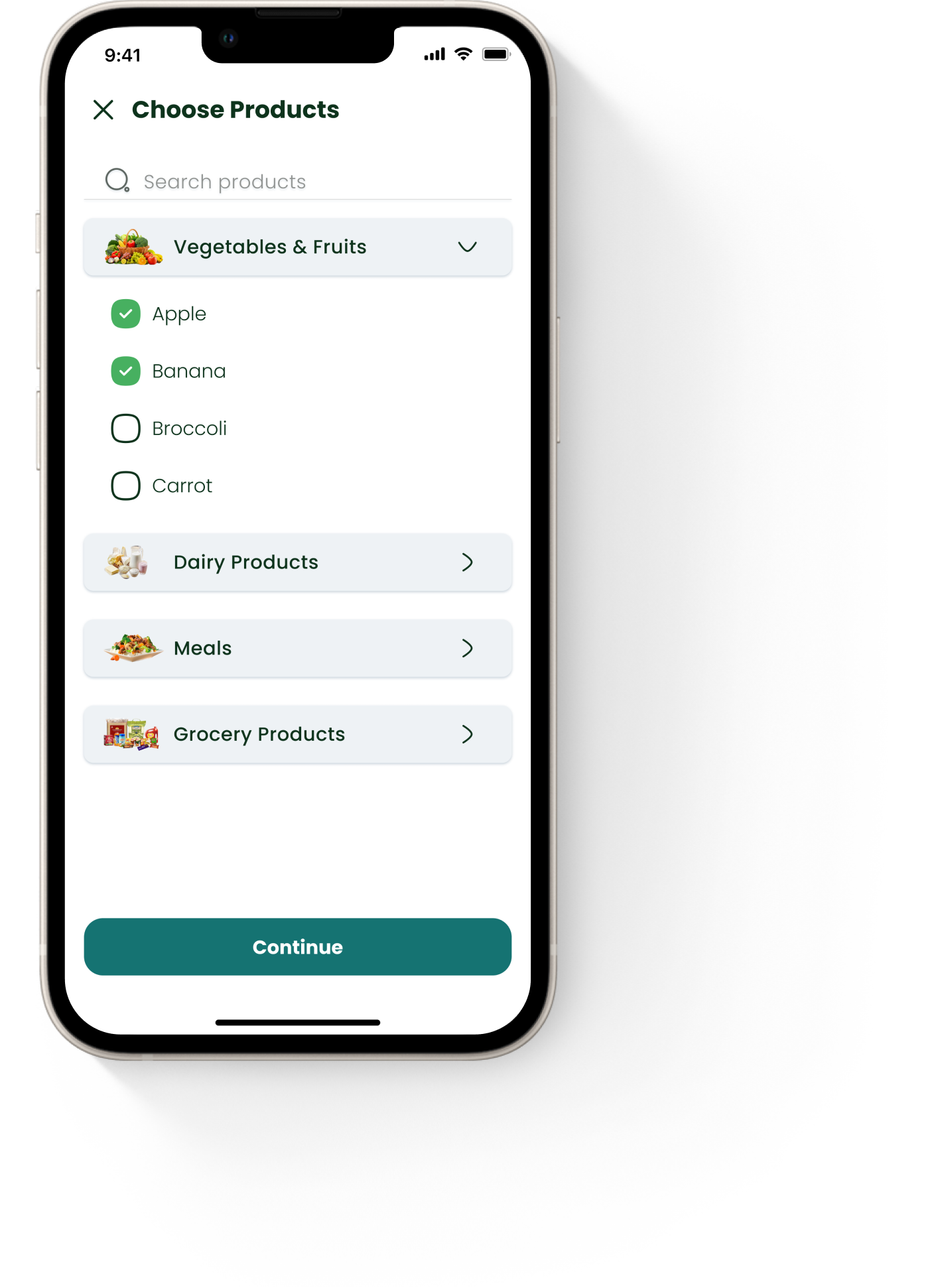
Donating flow should be very simple and effortless otherwise people won't use it. Keeping that in mind, I tried to make the flow as easy as possible.
Donating Flow
Users can choose different kinds of products from the categories after clicking on continue, they will be asked for different details depending on the chosen products (for ex, apple - quantity, yogurt - quantity & expiration date). Then if he/she is a first-time user they will need to fill in personal information such as phone number and address. Users might be interested in tracking the courier, so on the ‘Thank you’ screen is a secondary button ‘Follow Courier’ that opens the map.
What's next?
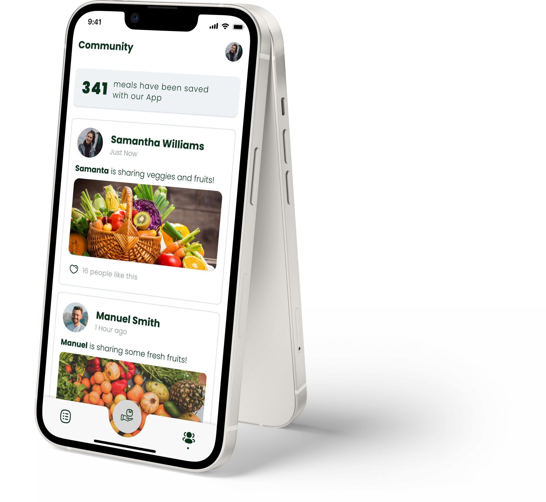
I believe that the overall mindset behind the intention of donation would need more exploration. Currently, there is an MVP of the community feature, where users can share their donations and see what others are sharing. If I'd continue working on this app, I would start with finding answers about the community feature, as well as conducting usability tests to discover how the existing design addresses users' pain points. There are some questions I’d consider first.
Some interview questions
How would people use the community?
Is it the right motivational feature?
Would they be interested in sharing and seeing others' donations?
What would be the best way to create a community in such kind of application?
What way would they prefer to measure products? How can I make this flow less time-consuming for the users?
What would be the best way to show the users how their donations are spent, who receives those products, and when?
App Screens
Thank you!
Click on the button if you’d like to check the prototype!
© 2021-23 Elene Zedginidze. All rights reserved.