Land Surveying Company Website
Responsive website, logo redesign and brand book for the land surveying company.
Project Overview
Background
Izoma LLC is an established land surveying company. Despite their proven success, they lacked an online presence. Izoma reached out to me to lead their digital transformation, which included creating a website and brand book, redesigning the logo and business cards.
My Role & Project Duration
Product Designer
“Website design”
“Logo redesign”
“Business card design”
“Brand Book”
3 weeks
The Goal
The aim was to craft an informative, user-centric website, offering essential information like Izoma's services and contact details. Additionally, to develop a blog to offer valuable insights to users and enhance the company's SEO efforts, accompanied by a comprehensive brand book.
Design System
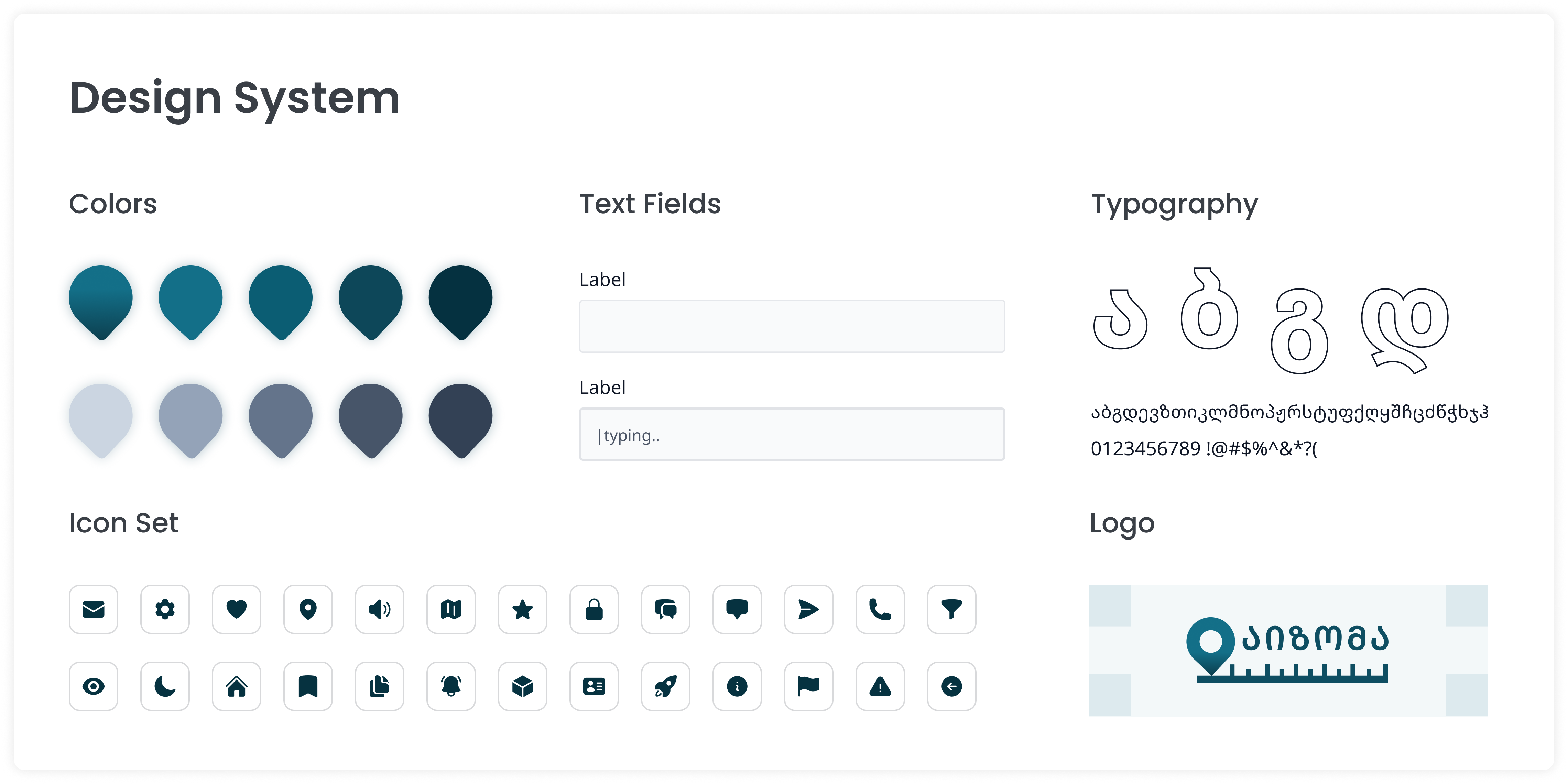
I chose the Noto Sans Georgian typeface and the corresponding icon set because of their perfect match in shape and form. This alignment creates a seamless visual connection that enhances overall design cohesiveness. Moreover, Noto Sans Georgian's support for Latin, Georgian, and Russian characters allows me to maintain consistency throughout this multilingual website.
Business Card Design
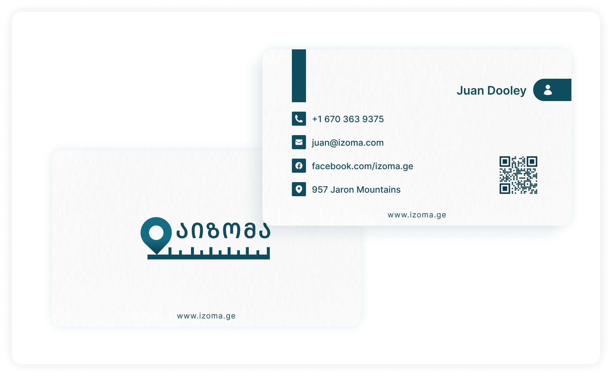
The logo redesign brought about subtle yet transformative changes that yielded a significant impact. By incorporating slight modifications, the logo now exudes a modern and fresh essence that aligns seamlessly with the company's core operations. The refined design retains the company's heritage while imparting a renewed sense of relevance. This evolution not only enhances visual appeal but also reinforces a more compelling representation of the company's work and values.
Logo
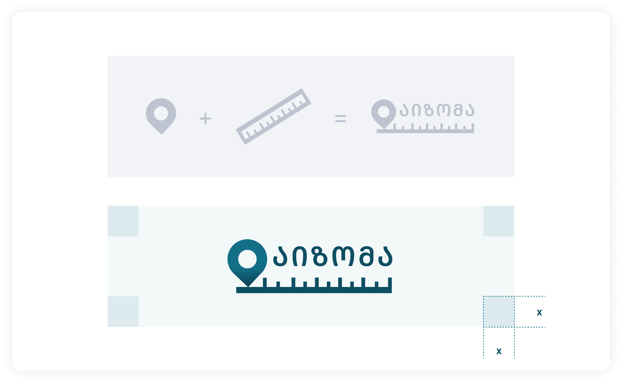
The logo redesign brought about subtle yet transformative changes that yielded a significant impact. By incorporating slight modifications, the logo now exudes a modern and fresh essence that aligns seamlessly with the company's core operations. The logo blends a location pin 📍 and a ruler 📏, forming a visual representation that encapsulates Izoma LLC's land surveying services. This combination conveys the company's expertise and focus in a clear and memorable way, showcasing their specialized field through a carefully designed emblem.
Understanding
When tasked with designing the website for Izoma LLC, a respected land surveying firm, I began by delving into research. This involved studying other companies in the same field to uncover prevailing design practices. By analyzing their websites, I gained valuable insights into what works effectively for users in this industry. This research provided me with a solid foundation to create a user-friendly website for Izoma LLC, incorporating proven design elements that resonate with their target audience and reflect industry standards.
About the Website
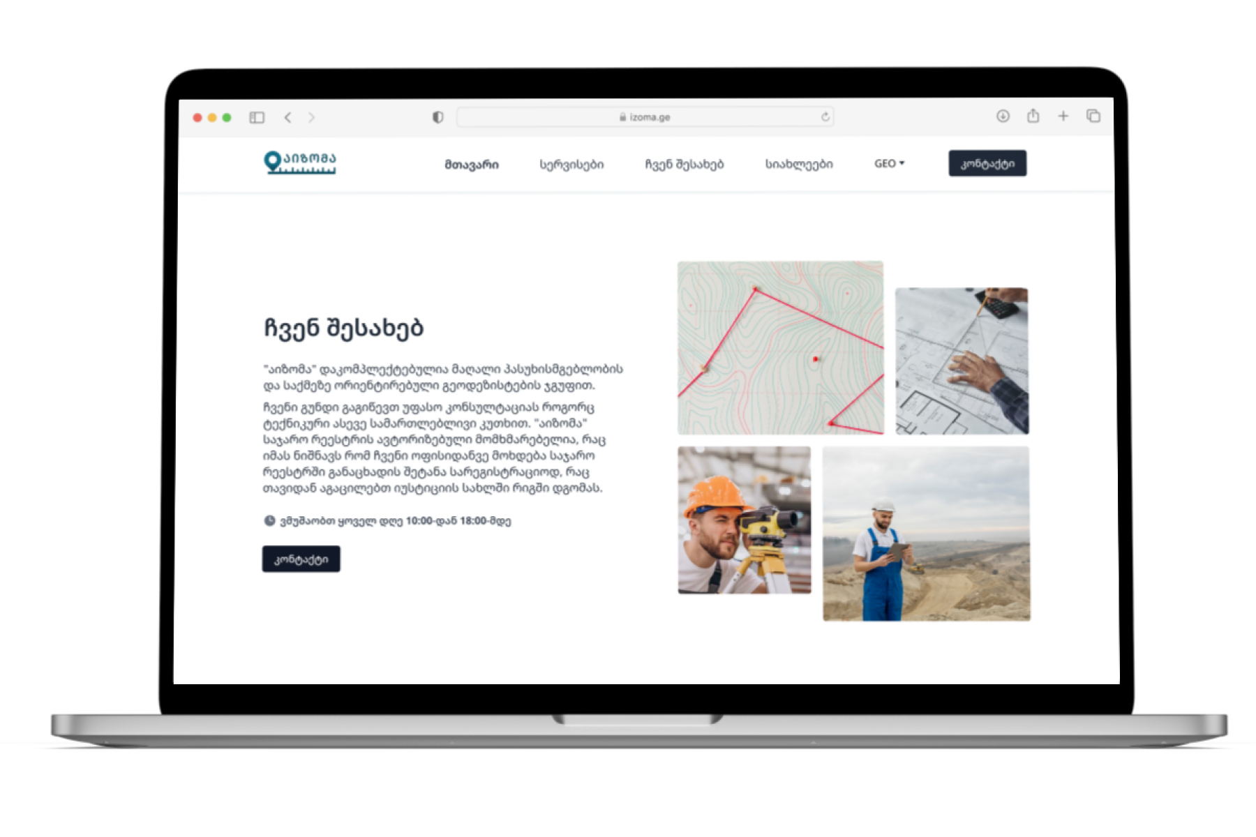
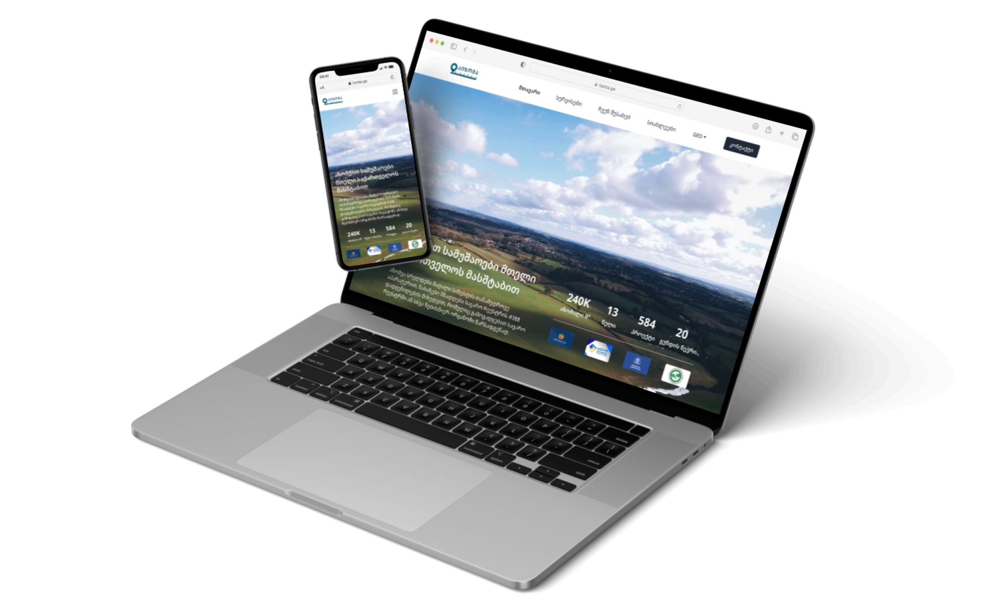
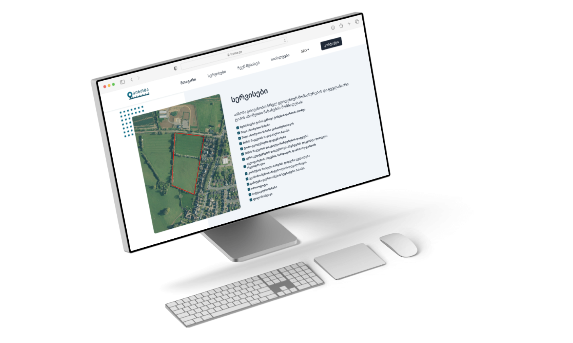
Izoma LLC's homepage is a dynamic hub, spotlighting impressive statistics and an engaging 'About' section to connect with visitors. The comprehensive 'Services' segment concisely presents their diverse offerings, while a user-friendly contact form ensures easy communication. The 'Blog Highlights' section showcases their expertise through featured articles, solidifying Izoma LLC's credibility within the industry. This cohesive homepage delivers a rich visitor experience that embodies the company's professionalism and commitment to excellence.
Engaging users
My approach to Izoma LLC's website design was guided by thorough research into industry norms, ensuring a user-centered experience that encourages interaction. The concise 'About' section strategically funnels users to the prominent 'Contact Me' button, while also communicating the company's working hours, fostering trust. This design approach blends professionalism with effective user guidance, creating a seamless path for initiating contact.

Responsive Website
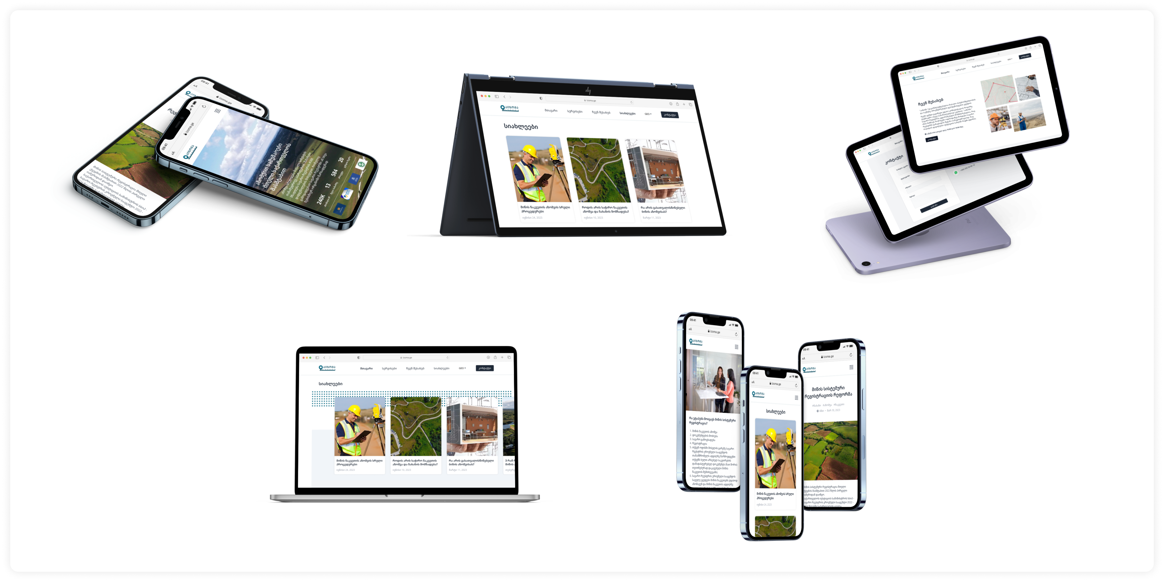
Website is fully responsive, providing seamless access across all devices, particularly mobile phones. With mobile devices being the primary browsing tool for Izoma’s customers, ensuring excellent responsiveness was a crucial aspect of the website's design.
Thank you!
Click on the button if you’d like to check the website!
© 2021-23 Elene Zedginidze. All rights reserved.